CASE STUDY: BRIGHTINSIGHT
Creating the brand identity for a leading digital health platform

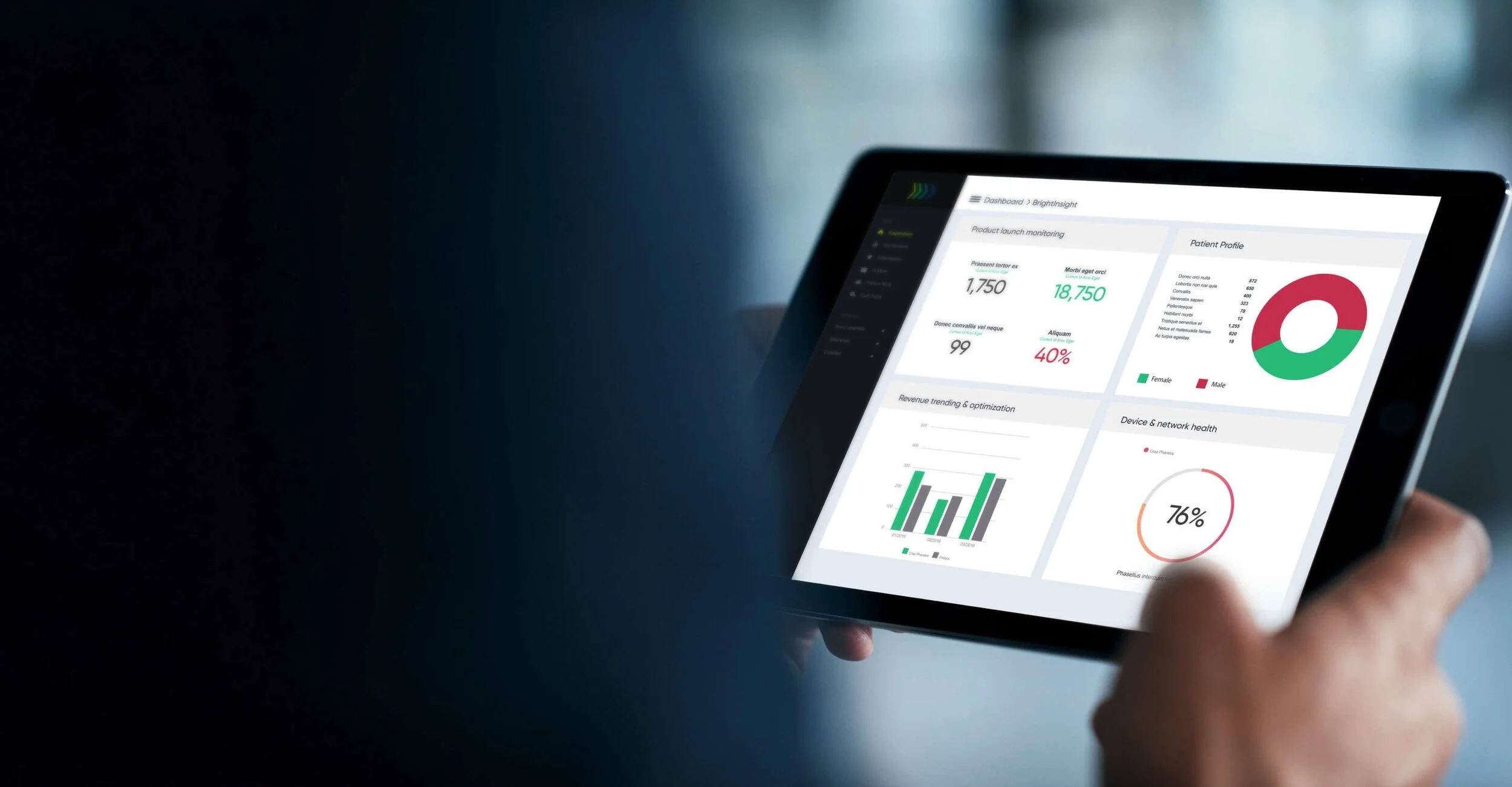
In 2017, Flex—the 25-billion-dollar electronics manufacturer formerly known as Flextronics—was preparing to launch a digital health platform. Customers would use the “medical-grade” platform to build, scale, and maintain connected medical devices. Destined to become the leading global regulated digital health platform for biopharma and medtech, the platform needed a brand identity.
Flex sought a name that spoke to intelligent, actionable insights and positive health outcomes. From 975 ideas Heirloom generated during the naming process, “BrightInsight” was selected for its ability to convey intelligence, positivity, and insightfulness. We then designed the “Arrow” visual identity, further imbuing the platform with a sense of action and acceleration while giving it the sophistication required to compete in the technology and healthcare spaces.
Launched in March of 2018, BrightInsight has spun off from Flex, successfully raised Series A and B financing, and won numerous awards including Google Cloud’s Partner of the Year for Healthcare & Life Sciences, Frost & Sullivan’s 2020 Global Entrepreneurial Company of the Year, and LinkedIn’s Top Startups 2020. Today, the platform and the company continue to help customers like AstraZeneca and Roche accelerate health innovation and improve treatments for patients.
